厦门Qkids久趣/英语中心 | Crossboundaries
项目背景:
Background
久趣,喻指“保持持久的动力,让学习充满乐趣”,这是 Qkids 久趣作为一家专业的教育科技公司一直以来秉承的教育理念,这也与 Crossboundaries 在教育空间设计中不断探索“寓学于乐”的想法不谋而合。

© 白羽
Qkids, a hugely successful online education platform, known for its high quality online English courses to so far to more than 800,000 students, has over the past years spent lots of resources and efforts in developing a narrative game-based online curriculum to spur and stimulate the kids' curiosity in learning, consequently helping them to grow into small global citizens.
.jpg")
© 白羽
从线上走向线下:
经过五年沉淀,久趣已在线上教育领域累积了较为丰富的经验,拥有80多万付费学员。基于对市场及用户需求的深度理解和分析,久趣希望进行OMO 模式的探索和创新,通过线上线下产品结合,将服务做得更为极致,满足用户多样化的学习需求。
Crossboundaries 受久趣委托,结合品牌形象,针对4-12岁儿童身心发展特点,充分感知场地优势,为久趣量身定制了第一间线下英语学习中心。
.jpg")
© 白羽
Its current venture is the expansion from online into off-line teaching, and the establishment of Qkids English Centers, aimed at 4-12 years old children who live in Chinese first-tier cities. These study centers are to reflect - just like the online platform - the Qkids educational philosophy of providing a long-lasting, immersive and fun learning experience. The first one to be opened is located in Xiamen, China.
.jpg")
© 白羽
Crossboundaries developed and tailored the first English Center to an existing space, to fulfill a multitude of requirements and to match closely the Qkids brand image and vision. The project site is located in Xiamen's Siming District, next to Xianyue Road, with a surrounding area that is rich in cultural and educational resources, also guaranteeing a good passenger flow. The space is long and narrow, on the street level of an architecture complex, with a large glass front window and main entrance facing a library building, and a secondary entrance on its narrow end, around the corner.
.jpg")
© 白羽
空间时间灵动多变:
项目前期,Crossbundaries 与久趣针对用户使用场景进行了长时间的探讨。作为一家从线上拓展到线下的教育科技公司,久趣十分看重用户体验,这间英语中心在课堂体验之外也同样强调多样化的公众体验,最终导致项目预估的总需求面积大于店面使用面积。
.jpg")
© 白羽
Expanding from successful online to offline teaching, the client considered it very important to provide a comparable stimulating environment for its customers with the aim of delivering anything but just a traditional classroom experience.
Diverse functions had to be accommodated - for different audiences, at various times of the week - Qkids students attending classes mainly on weekends, siblings, their parents and caretakers, prospect students and passersby exploring the bookstore or getting information about the Qkids brand, its educational offers or just attending an event in the Qkids Center.
.jpg")
© 白羽
而从运营时间上来讲,久趣线下英语中心作为一个课外学习产品,除双休日外用户对线下空间的利用率很低。所以如何实现,在空间和时间层面的“灵活”使用,成为了此次Crossboundaries 空间设计的一个重要课题。
The total demand of functions required exceeded the actual store space. Flexibility was yet again one of the key principles applied in Crossboundaries’ space design concept, flexibility in time and space - so that the center can cater for various functions, whilst it becomes an enticing, flexible and fun educational space and expresses the overall Qkids brand philosophy.

© 白羽
Crossboundaries 创始合伙人董灏说:
“对我们来讲,创造一个独特的空间,将Qkids久趣成功的线上教学经验扩展到现实的教学场景中是一个挑战,这其中要考虑到如何自然地将不同年龄组学生及家长们的需求融合在一起。
同时,我们提供了非常具有灵活性的设计概念,或者可以说是一个‘设计蓝图’,可适应未来更多Qkids久趣/英语中心门店的发展。“
"We had the challenge to create a unique space that expands Qkids' successful online teaching experience to a real-life scenario, by naturally integrating different age groups and parents’ demands", says Hao Dong, Founding Partner of Crossboundaries, "and at the same time, to provide a very flexible concept, a 'design master' that can be adapted to potential future Qkids English Center locations.”
.jpg")
© 白羽
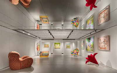
友善开放的空间
Qkids 久趣/英语中心位于厦门市思明区文化艺术中心鹭岛天地十字街心东北侧,建筑面积335平方米。店铺空间体块呈狭长形,长36m, 宽9m,自然采光条件欠佳。
建筑师决定拆除原有店招遮挡,将门头净高扩大至3.3m。一方面改善采光效果,另一方面将原本橱窗展示面扩大到极致,为客户带来更好的商业宣传效应以吸引更多潜在学员。
.jpg")
© 白羽
Framing the Parameters. The Blue Spine as the main feature
As a first step, Crossboundaries started to re-organize all necessary functions for the center based on the required degree of privacy and usage time. Integrated functions such as resting, play and display, were grouped as public areas (with less need of privacy) and re-arranged along the window front of the original shop. These public areas were given an improved visibility to engage and invite, representing the values and open mindedness of the Qkids Brand. Private areas (less visible from the outside, in the back of the space) were assigned to teaching spaces, office and supporting areas.
.gif")
© Crossboundaries
通透的落地窗让直面于街道的公共区域被赋予了更好的互动感和参与度,以友好自信的态度邀请过往人群关注,室内的种种活动激发了人们对于内部的好奇心,这也代表了久趣品牌的价值观和开放思想。同时,这样活泼别致的空间设计在鹭岛天地商业街也是独树一帜,是对街景的多元文化补充,更是企业文化与商业空间的巧妙转化与连接。
简洁的正面门头由喷砂金属板制作,与原有石材不产生冲突,但又通过其独特的磨砂质感、柔和丰富的光感以及简洁明快的形式凸显现代感,同时也能将室内场景框出画面感。
.jpg")
© 白羽
The main feature was developed, the blue spine, - a long sculptural body - running through the core of the narrow space, the blue interface holding everything together and allowing at the same time for connections and modular inserts.
The front is composed as a large cubic wall grid, which is built as a steel structure, with public function areas inserted, in form of vertical and horizontally stacked wooden modules, containing the more open reception area and clearer defined break out modules that can be shared by parents and students alike.
.jpg")
© 白羽
The upper modules became an exploration world designed solely for the little ones, within the cubic grid, in which children can climb up and engage in playful activities during breaks or whilst waiting together with parents for their siblings to finish class. Within the steel structure, there are partially visible, partially hidden cavities, that kids can crawl up and into, or from where they can catch a quick sight of what's going on in one of the classrooms.
功能集成空间
蓝色欢乐海洋:
久趣英语的主色调为蓝色和粉色,分别对应其主IP考拉和猴子,表达欢快鲜明的品牌形象。建筑师在设计中呼应了久趣英语产品平面设计中以蓝色为主色调的做法,汲取其品牌VI系统中二级蓝色色彩,在视觉上创造强有力的识别性,在空间体验上营造清爽与舒适感。
对使用者来说,环境的色彩倾向和色彩感觉是影响空间体验的重要因素;对建筑师来说,创造有记忆点的主题性商业空间,以色彩烘托商业氛围和营造空间品味的设计手段也逐渐成为一种潮流。
.jpg")
© 白羽
The blue spine, with its cubic matrix and modular volumes towards the front, also attracts potential new Qkids members and students, getting them intrigued in what is happening behind, in the classrooms.The blue element becomes the most prevailing, absorbing feature, to be playfully discovered by children, as a climbing passage with hidden places they can take into possession and which attracts strongly from the outside.
.jpg")
© 白羽
空间重组与玩乐汇融:
作为设计的第一步,Crossboundaries 首先根据私密程度和使用时间,将功能进行梳理和重组。例如,休息区,娱乐区和展示区相关功能被分组于公共区域,
并沿橱窗展示面布置;隐藏在后方的私密区域包含了教学空间,办公室和辅助空间。
建筑师通过置入一个横向贯穿于整个场地的蓝色集成空间,巧妙柔和地在各层级空间内建立了边界:前方的公共空间,中间的半公共走廊,后方的私密空间。
其次,建筑师将整合后的功能以木色模块水平或竖向堆叠的方式集成于蓝色空间上,充分发挥店面场地层高达4.5m的优势。
.gif")
© Crossboundaries
The overall space is arranged into areas of different levels of privacy, the blue spine facilitates a smooth transition from one layer to another - from a very public, very visible front to the semi-public corridor in the center and the private, non-public classrooms in the back.
.jpg")
© 白羽
"Presenting an accessible, open environment as well as sparking curiosity is part of the overall QKids Brand experience, we have continued this narrative from online to offline, and we layered the functional layout of the space accordingly, from very visible and public in the front to attract interest in what the center has to offer in more private areas in the back", explains Binke Lenhardt, Founding Partner of Crossboundaries.
Crossboundaries 的创始合伙人 Binke Lenhardt 说:
“提供有亲和力、开放式的环境以激发学员的好奇心是久趣品牌体验重要的一部分,而我们的设计将这一理念从线上带到了线下,同时,根据客户体验将空间分层:
以正面对外可见的开放性公共区域引起人们兴趣,以背面的私密区域提供核心教学服务。”
.gif")
© Crossboundaries
The blue interface also makes room for modular furniture elements that can be placed and modified flexibly and stored away within, at any time according to the actual scenario and the number of users.
.jpg")
© 白羽
虚与实的碰撞:
蓝色集成空间展示面由模数为800mm 的大型钢架组成。钢架的第一个重要作用:
以“虚”的手法分隔空间,便于前台对课时和非课时、学员和非学员进行区分管理,同时保持各层级空间之间的视线通透,允许室外自然光线通过空置的格架穿透至内走廊,从而减少有限净深带来的压迫感。
钢架的第二个作用:
作为4m 高的支撑结构与公共区域各木色模块焊接在一起。底层是为家长和学员共用使用设置的接待、休息和阅读区域,由木制和亲肤的软包垫组成。模块内固定家具与灵活家具组合搭配,可适应不同时段人数变化。
上层木色模块是专为学员们打造的冒险天地,小朋友与父母一起休息或等待时,可以通过攀爬进入到上面的小空间内进行探索,他们将会从不同视角有新的发现。
.gif") © 白羽
© 白羽
Inside. Outside. Fluid Relationships between separation and integration
Visual connections remain across the center's different functional areas and allow for a stimulating spatial experience. Throughout, the relationship between inside and outside, especially between public areas on the main glass front and its outside surroundings is kept fluid.
The storefront window was expanded in height, to give an opportunity to the public to get from the outside a glimpse straight into the contemporary, unusual English Center interior. The vast transparency of the store and the blue cubic spine are there to attract the community's curiosity whilst peeking in. It allows them to spot people inside, resting, chatting or browsing shelves, kids playing, in action, amidst a variety of open and closed areas and of different colors and materials. Hidden and not immediately visible from the main outside front, are the offices and a book display.
.jpg")
© 白羽
钢架的第三个作用:
为可移动的蓝色模数化家具提供摆放空间,所有家具布置方式可根据实际使用场景和使用人数随时调整。
前台在功能上承接了对学员与非学员的分流作用,不同高度的台面可分别供家长和小朋友签到使用,内嵌灯箱强调了前台的存在,时刻欢迎潜在用户、学员与家长的到来。
.gif")
© 白羽
The fluid spatial dialogue continues, with light, materials and textures playing an integral role. Outdoor light falling into the glass front can reach also the inner corridor through openings in the blue steel structure, its color deriving from the Qkids Visual Identity's color system. The choice of materials in general is meant to reflect the offline and online teaching environment that Qkids is offering and mirrors both, the digital world through silver-blue-metal references, as well the offline, the more sensorial world, with more lively, warm, smooth wooden textures and materials, to stimulate the senses of the children and heighten their curiosity.
A dividable reading zone, that can be accessed either from the main front entrance via the reception, or by the secondary entrance, includes a small display. It can be used by both, Qkids students and their parents as a waiting area and is defined more as a "members only" zone. Whenever there is a requirement to separate the book store (e.g. due to different opening hours or special events), it can be closed off with an electric blind.
.jpg")
© 白羽
The Qkids English Center's teaching zone in the back consists of three regular classrooms and one multi-functional one. All of them are configured in the same way and provide a neutral, plain environment in contrast to the outside. They contain a back wall with a smaller cubicle shelf wall for general and furniture storage, allowing students to quickly stow away stools to have the whole room for games and play time, opposite of that a wall used for multimedia teaching.
The classroom walls on one side are covered with felt to absorb sound and the walls facing the corridor (behind the blue spine), have window openings with sliding wooden panels, giving the the teaching spaces transparency to its surroundings and allowing parents to look inside if they wish to do so. The rooms' ceiling structure is a continuation of the cubic grid from the blue spine, it also provides additional sound absorption and simulates a skylight effect through uniform light distribution.
.gif")
© 白羽
空间的高效利用与流转
可独立书店:
次入口内设置了供学员和家长等候期间使用的阅读区和非学员使用的咨询区,当此区域作为书店单独运营时,可通过巧妙隐藏于天花上的电动卷帘将其分割为独立空间。
灵活的教室与趣味互动教学:
真正好的教育,应当遵循孩子的天性,在富有创意与灵感的学习体验中让个体收获有价值的成长,对儿童而言,游戏正是这样一种极为重要,且充满意义的学习方式。
.jpg")
© 白羽
Sliding doors between the reading space and the multifunctional class room can divide or expand the public space, and turn it from a standard classroom into a meeting, event or Qkids brand exhibition space. As the center gains more popularity and at peak times, when it needs to run more classes in parallel, this solution offers maximum flexibility for different requirements.
When used as a standard classroom, and separated again from the more public areas, students can get access through a side door to the member-only areas via the inner corridor.
.gif")
© 白羽
私密区域的三间常规教室以白色灰色设计为主,与教室外活泼的氛围形成鲜明对比,为学生们提供了一个更容易专注的学习空间。
所有教室配置均相同:使用面积27平米;教室前方主墙面有内嵌多媒体教学互动屏及磁力白板,参考儿童坐高与教师书写要求,互动屏底边高度设置在距地 800mm;
教室后方设置有储物及家具收纳空间,学员们进入游戏环节前,可迅速将塑料方凳收起以腾出完整的互动空间;教室侧墙覆盖白色毛毡,可满足吸音功能,并对学员作品进行展示。
.jpg")
© 白羽
A smart and inspiring Masterplan for future Qkids Centers
The flexible usage of space within given limitations, facilitated by modular and movable elements, has become a central theme and a strength in several Crossboundaries' school design projects. It was yet again tailored to the requirements of the Qkids English Center, that is used differently at various times of the week, that needs space for activities with different privacy requirements and that becomes a manifestation for both, the Qkids Brand's offline and online teaching experiences.
.gif")
© 白羽
教室天花是公共区域蓝色格子元素的延续,在起到一定吸音效果的同时,模拟均匀分布的天光效果。代课教师可根据多媒体教学与游戏场景对光照的不同需求,通过开关实现两种照明模式切换。
阅读区和多功能教室可通过一组移门进行合并和分割。移门开放时,多功能教室可作为公共区域的扩展空间使用,例如举行宣讲会、开学仪式、试听课、品牌文化宣传等;移门关闭时,多功能教室可作为一间标准教室使用,此时将开启位于内走廊侧门,供学员常规上课进出。
.gif")
© 白羽
The overall structure of the interior is made more intriguing, inspiring and children friendly through the limited use of colors and different material textures applied throughout the designs. Blue is an integral part of the Qkids Brand's visual language and became therefore the leading color, visible on the core feature, the blue spine, supported by a simple, geometric formal language and playfully integrated shapes of different sizes.
自然光与人工照明:
建筑师在灯光设计中充分考虑了光与人、空间、材料及色彩之间的关系,同时突出与品牌文化相关的科技感和现代感。整体灯光应用以面光源形式为主,并有多处面光源以模拟自然天光的手法置入空间,弥补了场地自然采光不足的缺陷,给使用者带来更舒适的空间体验。
.jpg")
© 白羽
小结
Qkids 久趣/英语中心作为 Crossboundaries 对少儿教育空间的又一次创新尝试,充分考虑了项目用地现状条件,通过对使用场景的分析以及对未来线下教育发展模式的考虑,优化了功能布局,使其动线清晰,分区明确有序。在空间和时间上为使用者提供了更多“灵活”使用的可能性。
整体设计通过简洁大气的形象、充分的艺术表现力和明朗活泼的色彩打造出具有 Qkids 久趣品牌识别性的语言,打破了传统少儿线下店的刻板印象,以有趣但不幼稚的空间形象呈现给大众。
.jpg")
© Crossboundaries
Another characteristic of Crossboundaries’ design is the flexibility of the elements used, for different functions, at different times of the week, but also to give children a ‘play and exploration' experience, and an offline platform for an enticing way to learn a foreign language, without being "childish".
Crossboundaries has also created essential master elements, defining the Qkids English Center look & feel for the future, a smart interior, yet an architectural solution, that can be adapted and leveraged in more 'off-line' English Centers to come.
项目基本信息:
项目名称:Qkids久趣/英语中心
地 址:中国,厦门
客 户:厦门千时科技有限公司
使用面积:300平方米
设计周期:2019年10月至2019年12月
施工周期:2020年1月至2020年4月
竣工日期:2020年5月
建筑设计:Crossboundaries, 中国,北京
Crossboundaries合伙人建筑师:蓝冰可(Binke Lenhardt), 董灏
Crossboundaries项目团队:顾畅,黄彪,郝洪漪,于泓浴
合作施工方:厦门华筑建筑设计事务所
摄影/摄像:白羽
Project Info:
Project name: Qkids English Center
Location: Xiamen, China
Client: Xiamen Qianshi Technology Co., Ltd.
Size (Usable floor area): 300 m2
Design period: October 2019 to December 2019
Construction period: January 2020 to April 2020
Completion date: May 2020
Architect: Crossboundaries, Beijing, China
Partners in charge: Binke Lenhardt, DONG Hao
Design team: GU Chang, HUANG Biao, HAO Hongyi, YU Hongyu
Construction Company: Xiamen Huazhu Architectural Design Office
Photographers: BAI Yu